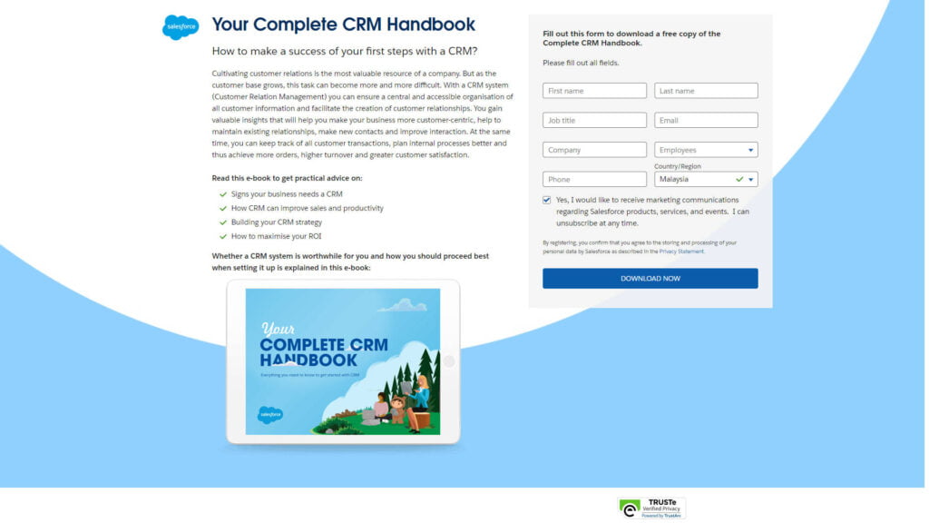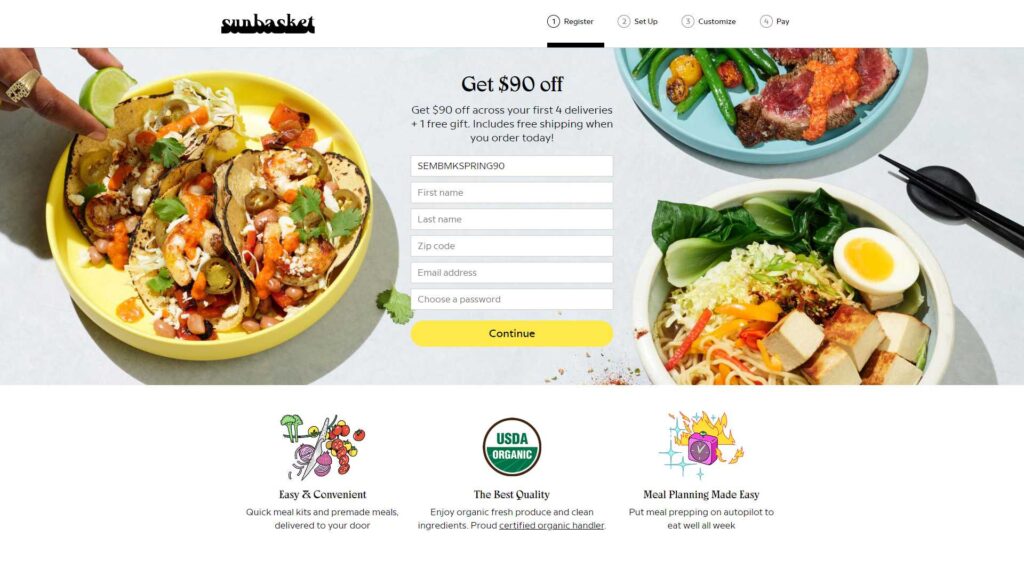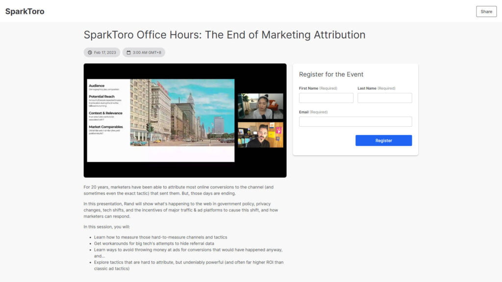
A landing page is a single web page that is specifically designed for a focused marketing or advertising campaign. Its primary purpose is to capture the attention of visitors and encourage them to take a specific action, such as signing up for a newsletter, downloading an ebook, making a purchase, or filling out a contact form. Landing pages are often used in digital marketing and online advertising campaigns to convert visitors into leads or customers.
Landing pages are an essential component of many online marketing campaigns because they help improve conversion rates and provide a way to measure the effectiveness of specific advertising or marketing efforts. By creating dedicated landing pages, businesses can tailor their messaging to match the interests and needs of their target audience, increasing the likelihood of achieving their campaign goals.
Landing Page:
1. Purpose: A landing page is designed for a single, specific purpose, such as lead generation, promoting a product, or encouraging a particular action (e.g., signing up for a newsletter).
2. Focus: It has a laser-like focus on a particular offer or message and is not cluttered with unrelated content.
3. Content: Landing pages typically have concise content, emphasizing the offer’s benefits and a clear call to action.
4. Navigation: Navigation options are usually limited or nonexistent to prevent distractions from the main goal.
5. Design: Landing pages are often designed for simplicity, with a clear hierarchy that directs the visitor’s attention to the call to action.
6. Analytics: Landing pages are closely monitored with specific key performance indicators (KPIs) to measure their effectiveness.
7. A/B Testing: Marketers frequently conduct A/B testing to optimize landing page elements for better conversions.
8. Linking: They are often linked to external sources like advertisements, email campaigns, or social media posts.
9. Single Page: Landing pages are usually standalone pages, not part of a larger website.
Website:
1. Purpose: Websites serve as a comprehensive online presence for a business, organization, or individual, offering information about various aspects of the entity.
2. Content: They have multiple pages that cover a range of topics, including about us, products/services, contact information, blog posts, and more.
3. Navigation: Websites have a full navigation menu that allows visitors to explore different sections and pages.
4. Design: Website design can be more complex, catering to a broader range of content and user interactions.
5. Analytics: Websites typically track a broader range of metrics, including traffic, user behavior, and more.
6. A/B Testing: While A/B testing can be done on websites, it is usually more extensive and covers a wider array of elements.
7. Linking: Websites can link to various internal pages and external resources, creating a comprehensive web presence.
8. Multiple Pages: Websites consist of multiple interconnected pages, offering a comprehensive overview of the entity.
In summary, the key difference is that a landing page is a focused, single-page destination with a specific goal, whereas a website is a more extensive online presence with multiple pages covering various topics. Landing pages are often used for targeted marketing campaigns, while websites provide a broader platform for presenting a wide range of information and content.
In today’s fast-paced digital landscape, businesses and marketers face the ever-evolving challenge of capturing the attention and interest of online visitors. Amid the vast sea of websites, advertisements, and content, one essential tool has emerged as a linchpin for successful online marketing campaigns: the landing page. This seemingly humble webpage plays a pivotal role in turning casual visitors into engaged leads and paying customers.
Its importance cannot be overstated, as it serves as the digital gateway to your offerings and acts as the first impression for potential customers. In this age of precision marketing and data-driven strategies, understanding why a landing page is important is fundamental to achieving marketing goals, maximizing conversions, and, ultimately, driving business growth. Landing pages are important for several reasons in the world of online business in general:
Landing pages are designed with a single, specific goal in mind, such as capturing leads, making sales, or getting visitors to take a particular action. This focused approach increases the likelihood of conversion because visitors are not distracted by irrelevant content or navigation options.
When visitors arrive at a well-designed landing page that aligns with their interests and the source that directed them there (e.g., an ad or email), they are more likely to take the desired action. This leads to higher conversion rates compared to sending visitors to a generic website page.
Landing pages provide a clear way to measure the effectiveness of your marketing campaigns. You can track metrics like conversion rate, click-through rate, and bounce rate to assess how well your landing page is performing and make data-driven improvements.
Landing pages allow you to tailor your messaging to a specific audience or offer. This personalization makes your message more relevant and appealing to visitors, increasing the chances of conversion.
Landing pages can be used for A/B testing (split testing) different elements such as headlines, images, CTA buttons, and content. This helps you refine your page over time to maximize its effectiveness.
Landing pages are commonly used for lead generation purposes. By offering valuable content like ebooks, webinars, or free trials in exchange for contact information, you can build your email list and nurture leads into customers over time.
In paid advertising campaigns, sending visitors to a landing page rather than a general website can result in a higher quality score and lower cost-per-click (CPC). This means you get more value for your advertising budget.
Landing pages are typically designed for a seamless and user-friendly experience. They load quickly, have clear navigation, and are often mobile-responsive, which improves user satisfaction.
Landing pages ensure that the content matches the ad or promotional material that brought visitors to the page. This consistency enhances user trust and reduces the likelihood of visitors leaving due to a mismatch between expectations and reality.
Landing pages can be used to collect valuable data about your audience, such as their demographics, interests, and preferences, which can inform future marketing efforts.
In summary, landing pages are essential tools for marketers to increase the effectiveness of their campaigns, optimize conversion rates, and gather valuable data. They provide a focused and tailored experience for visitors, which is key to achieving marketing objectives and improving the return on investment (ROI) for advertising and marketing efforts.
A well-designed landing page comprises several important components that work together to effectively engage visitors and encourage them to take a desired action. Here are some crucial components of a landing page:
The headline is the first thing visitors see, and it should clearly communicate the main benefit or message of the page. It should be attention-grabbing and relevant to the visitor’s needs.
A subheadline can provide additional context or information to support the headline. It should further emphasize the value proposition or offer.
Images, videos, or graphics can help convey your message and make the landing page more visually appealing. Visuals should be relevant and support the content.
The copy (text) on the landing page should be concise, persuasive, and easy to understand. It should explain the offer, benefits, and call to action (CTA) clearly.
Clearly state the value or benefits visitors will receive by taking the desired action. Explain how the offer or product solves a problem or fulfills a need.
The CTA is a crucial element that tells visitors what action to take next. Make it prominent, concise, and action-oriented (e.g., “Get Started,” “Download Now,” “Sign Up”).
If you’re collecting leads, a form is essential. Keep it simple and ask for only the necessary information. Ensure that the form fields are easy to complete.
Build trust with visitors by including elements like customer testimonials, reviews, trust badges, and privacy assurances. Trust signals can boost confidence in your offer.
Ensure that the content on the landing page aligns with the source that brought visitors there, whether it’s an ad, email, or social media post. Consistency is key.
With the prevalence of mobile devices, your landing page should be responsive and provide a seamless experience on smartphones and tablets.
If appropriate, include social sharing buttons that allow visitors to easily share the landing page with their network, expanding your reach.
Minimize distractions by reducing navigation options. The focus should be on the main message and the CTA.
Continuously improve your landing page’s performance by conducting A/B tests on various elements, such as headlines, CTA buttons, and images.
Implement analytics tools to track visitor behavior and conversion rates. This data helps you assess the page’s effectiveness and make data-driven improvements.
Consider using exit-intent pop-ups to capture leads or provide additional offers when visitors are about to leave the page.
A fast-loading landing page is crucial for retaining visitors. Slow loading times can lead to high bounce rates.
Include necessary legal and compliance information, such as privacy policies, terms of service, and GDPR compliance statements.
After a visitor completes the desired action, redirect them to a thank you page that confirms the action and provides further instructions or next steps.
By incorporating these components into your landing page design, you can create a persuasive and effective tool for achieving your marketing objectives and increasing conversions. Remember that testing and optimization are ongoing processes to maximize your landing page’s performance.
While I can’t provide specific visual examples since I can’t display images, I can describe three types of landing pages with effective design elements that have been successful in various contexts:
– Compelling Headline: The headline should clearly state the value of the ebook, such as “Unlock the Secrets of Digital Marketing Success.”
– Eye-catching Visual: An image of the ebook cover or a related graphic to visually represent the offer.
– Brief Description: A concise description of what the ebook covers, highlighting its benefits.
– Simple Form: A short form asking for the visitor’s name and email address.
– Strong CTA: A clear and enticing CTA button, such as “Download Now.”
– Trust Signals: Testimonials or reviews from previous readers or endorsements from industry experts.
– Privacy Assurance: A statement ensuring the visitor’s information will be kept confidential.

– High-quality Imagery: High-resolution images or videos of the product from different angles.
– Product Benefits: A list of key product features and the benefits they provide to the user.
– Pricing and Offers: Clearly presented pricing options, discounts, and any special offers.
– Customer Reviews: Authentic testimonials or user reviews with photos or names.
– CTA Buttons: Multiple CTA buttons for different stages of the buying process (e.g., “Add to Cart,” “Checkout”).
– Guarantee or Return Policy: Information on any money-back guarantees or return policies.
– Payment Security: Assurance of secure payment processing with logos of trusted payment providers.

– Event Details: Date, time, and a brief description of the webinar’s topic and benefits.
– Speaker Information: A brief bio and photo of the presenter to establish credibility.
– Registration Form: A form for attendees to input their name, email address, and any other necessary details.
– Countdown Timer: If applicable, a countdown timer to create a sense of urgency.
– Social Proof: Logos of companies or organizations that have benefited from the webinar.
– Reminder Options: Options to set reminders, such as calendar integration or email reminders.
– Replay Access: Mention whether the webinar will be recorded and accessible later.
– Clear CTA: A prominent “Register Now” or “Reserve Your Spot” CTA button.

These examples showcase different types of landing pages, each tailored to achieve a specific goal, whether it’s lead generation, product sales, or event registration. Effective landing page design focuses on delivering a clear and persuasive message, building trust, and guiding visitors toward the desired action.
Don’t let your competition get ahead of you. Create an amazing landing page for your products that convert. Let me help you skyrocket your sales. Contact me today.
mail: hello@amirulbaharudin.com
whatsapp: +6013 5988 270
location: Perlis, Malaysia
business registration:
202003149561(RA0058929-T)
business hours:
8:00AM to 5:00PM(GMT +8)
Always Open For Discussion
This site is protected by reCAPTCHA and Google Privacy Policy and Terms of Service apply